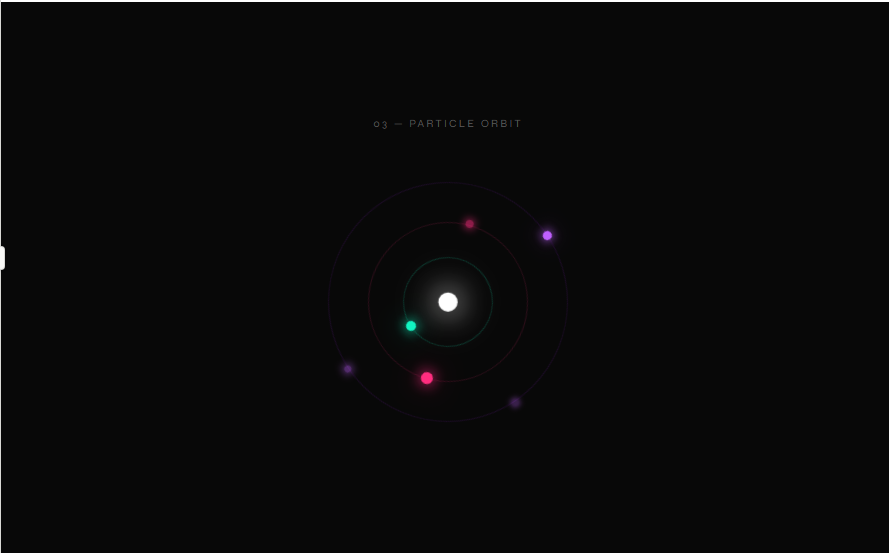
Orbit anim
CSS Animation
index.html
Login to Copy
<!DOCTYPE html>
<html lang="en">
<head>
<meta charset="UTF-8">
<meta name="viewport" content="width=device-width, initial-scale=1.0">
<title>Animation 03 — Particle Orbit</title>
<style>
  @import url('https://fonts.googleapis.com/css2?family=Syne:wght@400;700&family=DM+Mono:wght@400;500&display=swap');

  *, *::before, *::after { box-sizing: border-box; margin: 0; padding: 0; }

  body {
    background: #080808;
    color: #e8e8e8;
    font-family: 'DM Mono', monospace;
    display: flex;
    flex-direction: column;
    align-items: center;
    justify-content: center;
    min-height: 100vh;
  }

  .label {
    font-family: 'Syne', sans-serif;
    font-size: 11px;
    letter-spacing: 0.2em;
    text-transform: uppercase;
    color: #555;
    margin-bottom: 32px;
    text-align: center;
  }

  .orbit-scene {
    width: 280px;
    height: 280px;
    position: relative;
    display: flex;
    align-items: center;
    justify-content: center;
  }

  .orbit-core {
    width: 18px;
    height: 18px;
    background: #fff;
    border-radius: 50%;
    box-shadow: 0 0 20px #fff, 0 0 40px #ffffff88;
    z-index: 2;
    animation: pulse-core 2s ease-in-out infinite;
  }

  @keyframes pulse-core {
    0%, 100% { box-shadow: 0 0 20px #fff, 0 0 40px #ffffff88; transform: scale(1); }
    50%       { box-shadow: 0 0 30px #fff, 0 0 60px #ffffffaa; transform: scale(1.1); }
  }

  .ring {
    position: absolute;
    border-radius: 50%;
    border: 1px solid transparent;
  }

  .ring-1 {
    width: 90px; height: 90px;
    border-color: #0ff5c130;
    animation: spin1 4s linear infinite;
  }
  .ring-1 .dot {
    position: absolute;
    top: -5px; left: 50%;
    transform: translateX(-50%);
    width: 10px; height: 10px;
    background: #0ff5c1;
    border-radius: 50%;
    box-shadow: 0 0 12px #0ff5c1, 0 0 24px #0ff5c188;
  }

  .ring-2 {
    width: 160px; height: 160px;
    border-color: #ff2d7f25;
    animation: spin2 7s linear infinite;
    transform: rotate(60deg);
  }
  .ring-2 .dot {
    position: absolute;
    top: -6px; left: 50%;
    transform: translateX(-50%);
    width: 12px; height: 12px;
    background: #ff2d7f;
    border-radius: 50%;
    box-shadow: 0 0 14px #ff2d7f, 0 0 28px #ff2d7f88;
  }
  .ring-2 .dot-2 {
    position: absolute;
    bottom: -6px; left: 50%;
    transform: translateX(-50%);
    width: 8px; height: 8px;
    background: #ff2d7f88;
    border-radius: 50%;
    box-shadow: 0 0 8px #ff2d7f;
  }

  .ring-3 {
    width: 240px; height: 240px;
    border-color: #a020f020;
    animation: spin3 11s linear infinite reverse;
    transform: rotate(-30deg);
  }
  .ring-3 .dot {
    position: absolute;
    top: -5px; left: 50%;
    transform: translateX(-50%);
    width: 9px; height: 9px;
    background: #c060ff;
    border-radius: 50%;
    box-shadow: 0 0 10px #c060ff, 0 0 20px #c060ff88;
  }
  .ring-3 .dot-2 {
    position: absolute;
    bottom: -5px; left: 50%;
    transform: translateX(-50%);
    width: 7px; height: 7px;
    background: #c060ff66;
    border-radius: 50%;
    box-shadow: 0 0 8px #c060ff;
  }
  .ring-3 .dot-3 {
    position: absolute;
    top: 50%; right: -5px;
    transform: translateY(-50%);
    width: 6px; height: 6px;
    background: #c060ff44;
    border-radius: 50%;
    box-shadow: 0 0 6px #c060ff;
  }

  @keyframes spin1 {
    from { transform: rotate(0deg); }
    to   { transform: rotate(360deg); }
  }
  @keyframes spin2 {
    from { transform: rotate(60deg); }
    to   { transform: rotate(420deg); }
  }
  @keyframes spin3 {
    from { transform: rotate(-30deg); }
    to   { transform: rotate(-390deg); }
  }
</style>
</head>
<body>
  <p class="label">03 — Particle Orbit</p>
  <div class="orbit-scene">
    <div class="ring ring-1"><div class="dot"></div></div>
    <div class="ring ring-2"><div class="dot"></div><div class="dot-2"></div></div>
    <div class="ring ring-3"><div class="dot"></div><div class="dot-2"></div><div class="dot-3"></div></div>
    <div class="orbit-core"></div>
  </div>
</body>
</html>